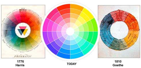
The colour wheel
The colour wheel is based on the primary colours, which are
red, yellow and blue. In 1666 Sir Isaac Newton developed the first colour wheel and it had been
developed since then.
There are then different categories of colour which are shown below:
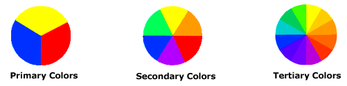
Primary Colors: Red, yellow and blue
In traditional color theory (used in paint and pigments), primary colors are the 3 pigment colors that can not be mixed or formed by any combination of other colors. All other colors are derived from these 3 hues.
In traditional color theory (used in paint and pigments), primary colors are the 3 pigment colors that can not be mixed or formed by any combination of other colors. All other colors are derived from these 3 hues.
Secondary Colors: Green, orange and purple
These are the colors formed by mixing the primary colors.
Tertiary Colors: Yellow-orange, red-orange, red-purple, blue-purple, blue-green & yellow-green
These are the colors formed by mixing the primary colors.
Tertiary Colors: Yellow-orange, red-orange, red-purple, blue-purple, blue-green & yellow-green
These are the colors formed by mixing a primary and a secondary color. That's why the hue is a two word name, such as blue-green, red-violet, and yellow-orange.

Warm and cool colours
The colour circle can be divided into warm and cool colours.Warm colours are vivid and energetic, and tend to advance in space.
Cool colours give an impression of calm, and create a soothing impression.
White, black and grey are considered to be neutral.
Complementary colour scheme
 Colours that are opposite each other on the colour wheel are considered to be complementary colours (example: red and green).
The high contrast of complementary colours creates a vibrant look especially when used at full saturation. This colour scheme must be managed well so it is not jarring.
 Analogous colour scheme
Analogous colour schemes use colours that are next to each other on the colour wheel. They usually match well and create serene and comfortable designs.Analogous colour schemes are often found in nature and are harmonious and pleasing to the eye.
 Triadic colour scheme
A triadic colour scheme uses colours that are evenly spaced around the colour wheel.
Triadic colour schemes tend to be quite vibrant, even if you use pale or unsaturated versions of your hues.
Split-Complementary colour scheme
 The split-complementary colour scheme is a variation of the complementary colour scheme. In addition to the base colour, it uses the two colours adjacent to its complement.
This colour scheme has the same strong visual contrast as the complementary colour scheme, but has less tension.
 Rectangle (tetradic) color scheme
The rectangle or tetradic colour scheme uses four colours arranged into two complementary pairs.
This rich colour scheme offers plenty of possibilities for variation.
Tetradic colour schemes works best if you let one colour be dominant.
No comments:
Post a Comment